10 Website Mistakes That Are Killing Your Conversions (And How to Fix Them)

10 Website Mistakes That Kill Conversions (and How to Fix Them Today)
🚨 Not getting leads or sales from your website? It might not be your offer — it could be your site.
Even small website mistakes can erode trust, create friction, and make your visitors bounce. Here are 10 common conversion killers and simple ways to fix them today.
1. 🧭 No Clear Call-to-Action (CTA)
The Problem: Visitors land and think: “Now what?”
The Fix:
- Use a bold, primary CTA like “Book a Free Quote”
- Place it above the fold and repeat it throughout the page
- Make your CTA button stand out with contrast and size

🔗 How to Craft High-Converting CTAs
2. 🐢 Slow Load Times
The Problem: 40% of users will bounce if your site takes over 3 seconds to load.
The Fix:
- Use WebP images for better compression
- Enable lazy loading
- Use a global CDN (Cloudflare, Netlify, etc.)

3. 📱 Bad Mobile Experience
The Problem: If your site isn’t mobile-optimized, you’re losing most of your visitors.
The Fix:
- Use a responsive framework like Bootstrap 5 or Tailwind
- Ensure buttons are thumb-friendly
- Test on real phones, not just browser previews

4. 🔍 Confusing Navigation
The Problem: Users can’t find your services or contact info in 2 seconds? They’ll leave.
The Fix:
- Limit menu items to 4–6
- Use clear labels: “Services,” “Pricing,” “About,” “Contact”
- Keep the logo top-left and the menu top-right

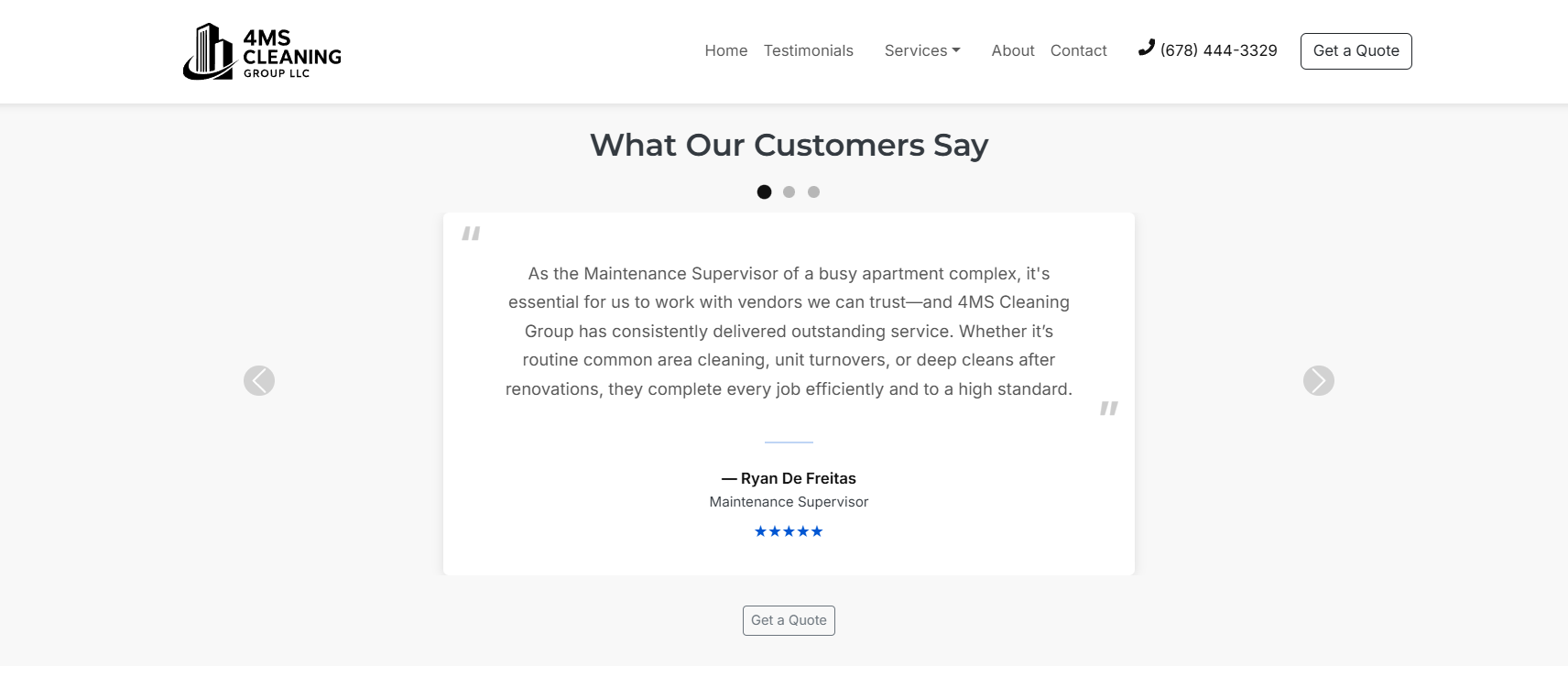
5. 💬 No Social Proof
The Problem: No reviews = no trust.
The Fix:
- Add testimonials, trust badges, or reviews
- Link to your Google Business Profile
- Showcase case studies if B2B
6. 🖼️ Generic or Bad Images
The Problem: Cheesy stock photos feel fake.
The Fix:
- Use real team photos or branded visuals
- Compress with tools like Squoosh
- Stick to a consistent style

7. 🧱 Cluttered Design
The Problem: Busy pages overwhelm users and reduce conversions.
The Fix:
- Embrace whitespace
- Use 2–3 fonts max
- Use headings to create a clear visual hierarchy
8. 🧠 Missing SEO Basics
The Problem: Beautiful site, but no one can find it on Google?
The Fix:
- Add meta tags (title + description)
- Use alt text for all images
- Create a
sitemap.xml - Use clean URLs like
/services/commercial-cleaning
9. 📪 Broken or Missing Contact Form
The Problem: Users want to reach out — but can’t.
The Fix:
- Add a simple contact form (Name, Email, Message)
- Test form submissions regularly
- Connect your form to your inbox or CRM
🛠️ Tip: Use tools like Formspree, Netlify Forms, or Firebase

10. 🔒 No HTTPS or Trust Signals
The Problem: If visitors see “Not Secure,” they’re gone.
The Fix:
- Add an SSL certificate
- Display a lock icon or “Secure Checkout” badge
- Link to your Privacy Policy and Terms

🚀 Final Thoughts
Small tweaks = big results.
✅ Start with your homepage — it gets the most traffic and sets the tone.
Ready to Fix This?
I build websites that are:
- ✅ Clean
- ⚡ Fast
- 📱 Mobile-optimized
- 💸 Designed to grow your business
👉 Book a Free Strategy Call — let’s turn your website into your best salesperson.